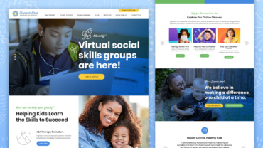
To coincide with the launch of their online class offerings, Discover Hope, a California based behavioral therapy company, wanted a fresh new look for their website. The focus should be on educating the public on ABA therapy, as well as highlighting the new classes.
This site was a dream to organize. I completely dissected the previous website content and reorganized it keeping the learning journey of the prospective client – a stressed out parent or caregiver – in mind. In addition to the content structure, keeping the look big, bold and colorful helps ensure the subject matter doesn’t become overwhelming.
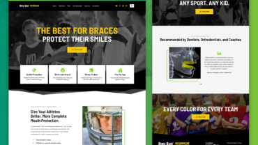
Built using the Brizy page builder, MouthguardPro.com is the home of the revolutionary Kid’s Comfort Pro mouthguard. A small, women-owned business based in Texas, the company had outgrown their (very) dated website and needed a smart, streamlined storefront with a premium look.
Customer education was a primary goal for the client, so it was essential to highlight the product benefits directly on the homepage. While the client was very attached to their previous black and neon palette, they were receptive to my suggestions to go with a clean, bold typeface and pops of bright colors to really hit home on the sports theme.
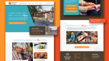
When it comes to assisted living care facilities, you almost never hear the description “modern design and stylish decor”. Fairhaven Denton set out to change this stereotype by creating a gorgeous, mid-century-inspired property with beautiful interiors and luxury amenities.
In addition to the fantastic, pre established brand, the mid-century vibe is communicated visually through bold color use. Subtle layered shapes and textures send the message that this is no ordinary care facility, and big, juicy buttons with large text encourage lead capture.
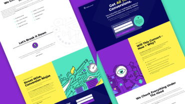
Will This Convert? is the brainchild of PJ Christie, Founder and CEO of Search & Convert. The service provides a website or landing page “audit” to entice potential customers to pay for SEO and web design services.
A poppy palette and whimsical graphics tell the user this isn’t your basic, boring tech company, and social proof testimonials double down on the message. The page is flanked by dual sign up forms to catch potential clients at different stages of their discovery journey.
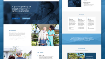
Enriched Senior Living (ESL) had been in operation for over a decade, but as the parent company behind other customer-facing brands, they never had a fully-formed brand identity or website of their own.
What they needed was a place to educate potential partners and employees of their mission, properties and job openings. With these goals in mind, I created a simple website with a simple message – who we are and what we do. And because ESL’s main objective is caring for others, I kept the styling simple with plenty of white space to let the heartwarming images shine.

