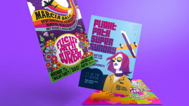
Flight Path Super Sunday is a yearly music festival on Austin’s east side. The clients have a whimsical sense of humor and insist on two things in their festival posters – plane imagery and “hippie vibes”.
Putting together these posters is the highlight of my year. Working hand in hand with the client, we brainstorm wacky ideas and create 3-4 initial mockups to mull over. Once a winner is selected, I fully-flesh out the concept and the rest is rock and roll history.
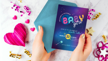
Everyone has been to a baby shower full of flowers or baby animals, but to work on a galaxy themed shower was a real treat. I created a full suite of assets for the client, from photo backdrops to thank you cards, but the invitations are the first piece the guests will see, and really sets the tone for the event.
Looking for a poppy palette that says girl without being too girly, I pulled from galaxy images for the pink, aqua, purple, and marigold. Chunky uppercase letters and elementary school script ensure that the invitations read “baby” more than Star Wars.
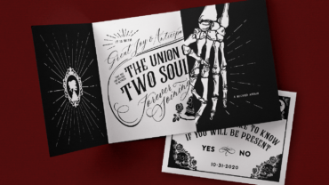
My engaged-couple clients were planning a wedding on Halloween and came to me asking for a gothic, spooky invitation suite. A black and white palette was a must, and we decided on a gate-fold invitation to maximize space for illustration and information.
I am particularly proud of how these turned out. From the skeletons holding hands on the outer flaps, to the intertwined typographical details on the inner, they remain one of my favorite projects of all time.
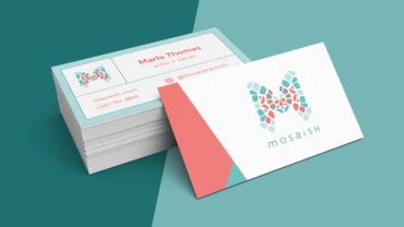
Mosiash, a woman-owned mosaic business based outside of Tampa, Florida, came to me in need of a brand identity and business print suite to take their small endeavor to the next level.
The icon I created is a combination of the letter “M” to represent the brand name, as well as a butterfly per client request. Both are tied together with the mosaic visual effect, making it clear at first glance what the business does. The coral and turquoise colors keep it feeling feminine and beachy.
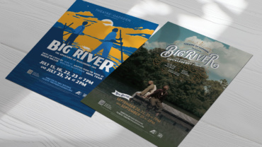
I have been lucky enough to become involved with Theatre of Gadsden, the premier local theater company in Gadsden, Alabama. The theater had everything working in its favor except lackluster graphic design.
It’s been a real joy dedicating my time to creating posters, programs, billboards, apparel, social media assets and more for the home of an artform I hold so near and dear to my heart!
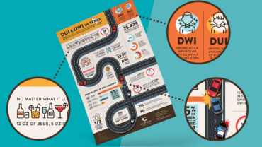
The team at Carreras Law Group asked me to create an infographic of DWI statistics to be used in a social media campaign offering assistance in drunk driving arrest cases.
This was a true labor of love! Without a copywriter or any provided data, it was up to me to scour the Texas Department of Transportation databases for statistics. From there I organized the information into digestible chunks, and created a visual story using car and road imagery.
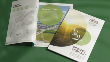
The Haven at San Gabriel was the first new-build property from the team at Enriched Senior Living, and the first to-do on the list was to find investors to fund the project. The client requested an information packet in PDF form to provide to potential investors. The requirements: robust information and a premium look.
Using InDesign, I put together a 21-page project summary that included any and all information a potential investor might want – location details, budgets, blueprints, renderings, timelines, team resumes, and much more. Upon delivery, the project was fully-funded in 4 days.
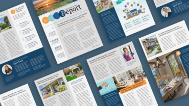
A challenging request was sent to me by the Bevers Real Estate team. They asked me to create a reusable newsletter template they could adjust depending on that month’s content. And they needed it all done in Microsoft Word. Gasp.
What resulted was a 9 page template that was fully branded and reusable, with mix-and-match sections the team could rearrange to provide a fresh look each month. The sections are resizeable based on content length, and the font styles are preset to keep the visuals consistent.
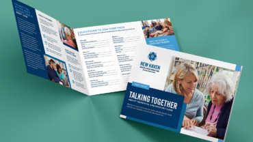
New Haven Assisted Living & Memory Care had a number of useful docs buried in their filing cabinets, but weren’t making use of them for sales purposes. My team and I decided to take 3 such docs and turn them into downloadables to generate leads towards rentals.
I jumped at the chance to use InDesign to create a stunning, interactive PDF that users can download, fill out, and share with their families. The new doc offers the user a much more positive learning experience than the original, and set New Haven up for a steady stream of new leads.
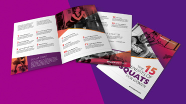
Invictus Fitness is a woman-run, personal training business in the Austin, Texas area. The owner Nicole was looking to up her enrollment, and needed a way to entice potential clients to share their email.
Together we came up with the plan to design an e-book that shares some juicy trainer tips you would usually only get during a session. The book, along with an Unbounce landing page, created a path for client conversions – a huge step forward for Nicole and her previously word-of-mouth business.
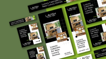
LAVISH kitchen + bath is a small luxury retailer from Austin, TX, who specializes in handcrafted, high-tech cabinetry for premium home builds and remodels. In order to attract customers to their showroom and website, we created search ads that keep the product images front and center, and used a modern, unconventional layout to convey that high-tech, high-end feeling.
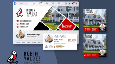
For a realtor, a professional outward appearance can mean more business, and social media platforms are a powerful tool to increase networking opportunities. For this client, we started with a new logo lockup with a usable glyph and wordmark. From there the set was fully fleshed out with social avatar images, cover images, post templates and an email signature.

